Player Sentiment Tool
Why did it take five clicks and a login to tell us something was broken?
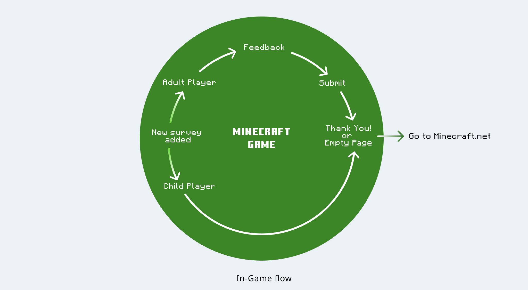
In a game played by over 100 million players, Minecraft lacked a way for players to share how they felt—without leaving the game. Most feedback flowed through an external website few players visited. As a result, meaningful insights were lost, and developers flew blind.
I led the UX design for the first in-game sentiment tool—embedding a feedback system that was fast, accessible, and scalable across all device types. What began as a simple smiley-face interaction evolved into a platform-wide design pattern, changing how Minecraft listens to its players.
Overview
As part of the Minecraft Player Lifecycle Management team, I led the UX design of an integrated feedback tool within the game client. The goal was to collect player sentiment more efficiently without disrupting gameplay. The feature was launched across mobile, console, and PC platforms, increasing feedback volume threefold and reducing internal processing time by over 50%.

Problem
Minecraft lacked a built-in way to collect feedback. Players were directed to an external website to report bugs or submit suggestions, resulting in:
- Low response rates and poor engagement
- Limited visibility into player sentiment around updates
- High internal cost to sort and analyze feedback

Strategy
To improve participation, I proposed embedding the feedback system directly into the game. The approach focused on:
- Minimizing Disruption: Designed a lightweight, skippable interaction that let players quickly share sentiment (e.g., “happy” or “sad”).
- Cross-Platform Support: Built for consistency across touch, controller, and keyboard interfaces.
- Template-Based Deployment: Created a scalable survey template that automatically routed responses into internal tools for cross-team analysis.
Execution
I led end-to-end UX design for the feature—from initial wireframes to production handoff:
- Designed flows and high-fidelity mockups in Figma
- Collaborated in weekly sprints with PMs, engineers, and QA
- Ran user testing with 8 players and iterated based on insights
- Ensured compliance with WCAG accessibility standards
We also defined logic rules for when and where the feedback prompt would appear, ensuring it integrated seamlessly with game moments like pause screens and post-match states.
Result
- Cut feedback collection time by over 50%
- 3x increase in submission volume with clearer, more relevant data
- Helped identify and resolve top player pain points earlier in the dev cycle
- Adopted as a design template for other Player Lifecycle initiatives
- Introduced a reusable full-image button component into the Minecraft UI system
Design process
Brainstorm
From Creative Energy to Strategic Focus
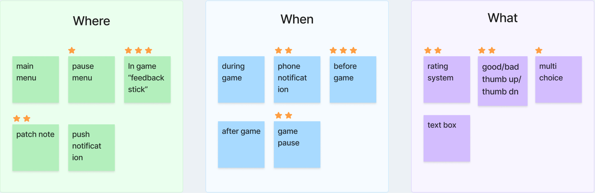
In early brainstorming, one idea—the “feedback stick,” an in-world character who gave players a survey item—stood out for its charm. I appreciated its creativity but raised three issues:
- Discoverability: Too easy to dismiss, unfamiliar interaction would require additional onboarding.
- Technical Load: Introducing an in-world object increased dev complexity and QA risk.
- Gameplay Disruption: Most importantly, the design interrupted the core gameplay flow by forcing players to engage with a non-standard object in the environment.

Instead, I redirected the team to explore surfaces players already trust—like the Player Inbox—striking a balance between delight and scalability.
This early decision not only shaped the rest of the design process—it also set a precedent for how we would evaluate ideas throughout the project: balancing creativity with clarity, and ambition with feasibility.
Early Design
Exploring Layout Possibilities
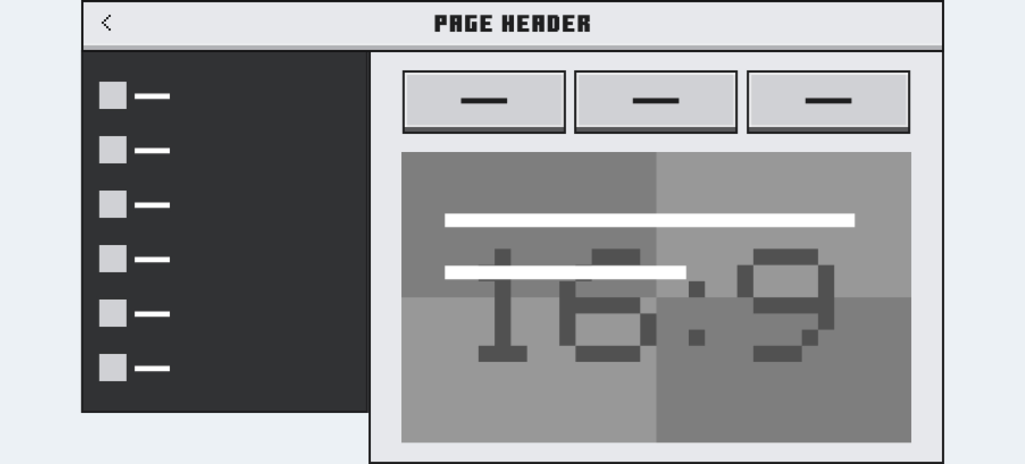
With the Player Inbox selected as our delivery surface, I began exploring layout directions for how sentiment surveys would appear.A key stakeholder concern was maintaining visibility for Minecraft.net, especially when no survey was active. To address this, I explored two interface elements—cards and buttons—as potential entry points to Minecraft.net.
I presented three options to the Minecraft design team for review:

The team initially favored the card-based layouts for its visual richness, but I flagged its vertical bulk as a risk for mobile responsiveness.I recommended Option 3, a more compact button-first layout that preserved space for active surveys while still linking to Minecraft.net when no survey was present. The team aligned with my proposal and adopted it as our baseline.
To improve visibility, I then optimized the image area to keep content above the fold. However, Stockholm’s design team enforced a 16:9 image ratio for consistency. That pushed the survey too far down—especially on mobile.
To address this, I revised the layout to move the buttons to the top, ensuring visibility regardless of device size.
The winner is
Still, I felt there was room for improvement. I consulted the dev team about dynamically adjusting the layout based on whether a survey was active. They confirmed it would be technically feasible with minimal effort.
Based on that, I proposed a conditional layout:
- If a survey exists → it's shown at the top
- If no survey → the buttons move up
This ensured key actions were always prominent without extra engineering overhead.

Design Refinement
Balancing Clarity and Charm
Once the layout was set, I raised concerns about text readability over background images, especially on mobile. To meet accessibility goals, I proposed switching to a clean color block layout.

This approach met resistance—Minecraft had never used this style before. Stakeholders worried it felt off-brand compared to the usual pixel panels or background images used for visual impact.
To move forward, I reframed the discussion around accessibility and clarity. I demonstrated how the color block layout improved legibility, supported mobile scaling, and reduced distraction. I also collaborated with the Stockholm guideline team to loosen the strict 16:9 constraint, unlocking more layout flexibility.
With those adjustments, we secured approval—establishing a cleaner, more scalable pattern for future surveys.
Pushing Visual Boundaries
Introducing an Unprecedented UI Component
One of the most rewarding aspects of working on Minecraft is the team’s shared passion for creating captivating, player-centered experiences. However, after we replaced the background image with a cleaner color block layout to meet accessibility standards, some stakeholders raised concerns that the interface no longer felt visually compelling.
In response, I proposed shifting the visual emphasis from the background to the interactive element itself—the button. I introduced the idea of a full-image button, a visually immersive and theme-adaptable component that could enhance visual engagement while preserving readability and accessibility.


The full-image button was a first for Minecraft’s UI system. Traditionally, the interface either relied on neutral gray pixel blocks or full-image backgrounds to draw attention—never on image-based interactive elements. This made our proposal highly unconventional.
Stockholm’s design guideline team, which oversees UI consistency across all markets, was hesitant. Their concerns weren’t about technical feasibility—the submission requirements were mostly standard graphic specifications—but rather about precedent and control. Allowing a U.S.-based team to introduce a new component could set a broader directional shift, and initial feedback reflected that tension.
I knew strong internal alignment would be essential. I coordinated with PMs and engineers to ensure the U.S. team was fully on board, and led several presentations to reinforce the design’s value—emphasizing its accessibility compliance, thematic flexibility, and potential for reuse across future campaigns.
To strengthen our position, I also proposed a user test to gather direct feedback from players. This would not only validate our design rationale, but serve as clear, data-backed evidence to address stakeholder hesitation.
Partial of submission file

Validating with Users
A/B Testing
We ran an A/B test with 8 players comparing the new button (Variant A) against the legacy version(Variant B).

Test flow

As shown in the user flow diagram, the test revealed several key insights:
- 5 of 8 preferred Flow A for its clean look and fun design
- Most found the flow intuitive and easy to navigate
- Players wanted more variety in questions and a neutral option
- Mobile players preferred submitting bugs/suggestions without leaving the app
These findings confirmed the design direction and informed future improvements.
Localization Test
Ensuring Global Readability
To validate layout resilience across languages, we conducted localization tests using German and Finnish—two of the longest languages in terms of word structure. Results helped finalize font and spacing choices for consistent readability across all supported locales.Based on these findings, we replaced the existing bold font with a slightly smaller, more flexible type size to ensure text remained legible without breaking the layout on narrow or text-heavy translations.

Final Design
The final UI featured a clean, accessible layout with a dynamic, reusable button component. It balanced business goals with player delight, set a new precedent for in-game feedback, and served as a model for future features.

Cross-platform

Impact
- 50%+ faster feedback collection
- 3× more player submissions
- Systemic influence: established reusable components and unlocked design flexibility
- Player-first thinking: initiated UX testing workflows around feedback, accessibility, and language
- Cross-org alignment: gained stakeholder buy-in and Stockholm guideline team approval for proportion changes
This project redefined how Minecraft listens to players—making feedback feel like part of the game, not apart from it.
Next Steps
This project laid a solid foundation for in-game feedback collection, but it's just the beginning. Now that we’ve lowered the barrier to entry and tripled response volume, the next step is to deepen our understanding of player behavior over time. With more consistent feedback coming in, future surveys can become smarter—more timely, personalized, and relevant.
Long-term, this system creates an opportunity for more targeted in-game communication and more player-informed design decisions. It also sets a practical example for designing future UI architecture that works seamlessly across all device types.


